Accessibility lawsuits in the United States have exceeded 4,000 filings per year for the past several years running - and that number climbs consistently. In the European Union, the European Accessibility Act entered enforcement in June 2025, making WCAG 2.1 AA compliance a legal requirement for most digital products and services. For developers who have treated accessibility as a "nice to have," the window for deferring that work has closed.
WCAG 2.2, published by the W3C in October 2023, is the current normative standard. Understanding it is not a compliance checkbox exercise - it is a prerequisite for building web experiences that function correctly for the full range of human users. This guide walks through the standard, what changed from 2.1, and the concrete implementation steps you can act on immediately.
What WCAG 2.2 Is and Why It Matters Now
The Web Content Accessibility Guidelines (WCAG) are a set of technical specifications published by the W3C's Web Accessibility Initiative (WAI). They define how to make web content perceivable, operable, understandable, and robust for people with disabilities - covering visual, auditory, motor, cognitive, and neurological conditions.
Each success criterion in WCAG is assigned a conformance level: A (minimum), AA (standard), or AAA (enhanced). Legal frameworks in most jurisdictions require AA conformance. WCAG 2.2 supersedes 2.1 and adds nine new success criteria, removes one, and refines the guidance around several existing ones.
The legal pressure is now concrete on both sides of the Atlantic. The EU's European Accessibility Act covers e-commerce, banking, transport, and digital services. In the US, the Department of Justice confirmed in 2024 that WCAG 2.1 AA satisfies the ADA's requirements for web accessibility - and plaintiffs' attorneys have been applying that standard aggressively in federal court. Any site serving users in these markets should treat WCAG 2.2 AA as the baseline, not an aspiration.
Beyond legal risk, accessible sites consistently perform better on Core Web Vitals metrics, score higher in automated SEO audits, and convert better across assistive technology users - a market segment that represents over one billion people globally.
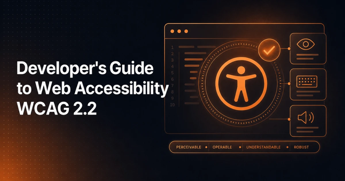
The Four POUR Principles
Every WCAG success criterion maps to one of four foundational principles. Understanding the principles first makes the individual criteria far easier to reason about during implementation.
Perceivable
Information and interface components must be presentable to users in ways they can perceive. This means content cannot rely on a single sensory channel. A video with no captions excludes deaf users. An image with no alt text excludes blind users. A UI that communicates state through colour alone excludes users with colour vision deficiencies. The perceivable principle covers text alternatives, time-based media, adaptability, and distinguishability (contrast, spacing, resize behaviour).
Operable
All functionality must be operable through multiple input methods. Keyboard operability is the foundation here - if something works only by mouse, it is inaccessible to users who rely on keyboards, switch controls, or voice input. The operable principle also covers timing (giving users enough time to complete tasks), seizure and physical reaction safety, navigation aids, and input modalities.
Understandable
The UI and its information must be understandable. This covers readable text (including language declarations), predictable behaviour (pages should not change context unexpectedly), and input assistance (error identification, labels, suggestions). Cognitive accessibility lives primarily here - clear language, consistent navigation, and helpful error messages reduce the burden on users with cognitive or learning disabilities.
Robust
Content must be robust enough to be reliably interpreted by a wide variety of user agents, including current and future assistive technologies. This principle is where correct HTML semantics and ARIA usage become critical. Markup that "looks fine" in Chrome but fails validation may render unpredictably in screen readers or voice navigation tools.
What Changed from WCAG 2.1 to 2.2
WCAG 2.2 introduced nine new success criteria and removed one (4.1.1 Parsing, which was deprecated because modern browsers handle malformed HTML more consistently). The new criteria address gaps that WCAG 2.1 left around cognitive accessibility, mobile input, and focus management.
New success criteria at a glance
2.4.11 Focus Not Obscured (Minimum) - AA: When a component receives keyboard focus, it must not be entirely hidden by author-created content such as a sticky header or cookie banner. Partial obscuring is acceptable at AA; full concealment is not. This directly affects the common pattern of fixed navigation bars that cover focused elements during keyboard navigation.
2.4.12 Focus Not Obscured (Enhanced) - AAA: The stricter version requires the focused component to be fully visible - no part of it may be covered by sticky content.
2.4.13 Focus Appearance - AAA: Specifies minimum visual requirements for focus indicators: the focus area must have a perimeter of at least the component's CSS border-box perimeter, a contrast ratio of at least 3:1 between focused and unfocused states, and a contrast ratio of 3:1 against adjacent colours. Most default browser focus outlines do not meet this at AAA, but the AA criterion (2.4.7) still requires that focus indicators be visible.
2.5.7 Dragging Movements - AA: Any functionality that uses a dragging motion must also be achievable with a single pointer without dragging. Drag-and-drop interfaces, sliders, and sortable lists all require a pointer-only alternative.
2.5.8 Target Size (Minimum) - AA: Interactive targets must be at least 24x24 CSS pixels, with some offset exceptions. The AAA criterion from WCAG 2.1 (44x44px) remains, but 24x24 is now the enforceable minimum. Small icon buttons and densely packed navigation links are the most common failures.
3.2.6 Consistent Help - A: If a help mechanism (phone number, chat, contact form) appears across multiple pages, it must appear in the same relative location on each page. This primarily affects site-wide support widgets and footer contact patterns.
3.3.7 Redundant Entry - A: Users should not be required to re-enter information they have already provided within the same session, unless re-entering is essential (e.g. for security confirmation). Multi-step forms are the primary concern.
3.3.8 Accessible Authentication (Minimum) - AA: Authentication processes must not require solving a cognitive function test - such as a CAPTCHA or memorising a password - unless an alternative is available, or the test involves recognising objects or user-provided content. This criterion has direct implications for login forms and bot-prevention mechanisms.
3.3.9 Accessible Authentication (Enhanced) - AAA: Removes even the object-recognition exception from 3.3.8.
Practical Implementation Checklist
The following covers the highest-impact implementation areas for developers. Each point maps to one or more WCAG 2.2 success criteria.
Semantic HTML
The single most effective accessibility intervention is using the correct HTML element for its intended purpose. A <button> is keyboard-focusable, activatable with Enter and Space, and communicates its role to screen readers by default. A <div> with a click handler does none of those things without significant ARIA patching. Use <nav>, <main>, <header>, <footer>, <article>, and <section> to create a navigable landmark structure. Use heading levels (<h1> through <h6>) to reflect document hierarchy, not visual size preferences.
Keyboard Navigation
Every interactive element must be reachable and operable by keyboard. Test your entire UI using only Tab, Shift+Tab, Enter, Space, and arrow keys. The tab order must follow a logical reading sequence - typically top-to-bottom, left-to-right. Avoid tabindex values greater than 0, which create unpredictable focus order. Modal dialogs must trap focus while open and return focus to the triggering element on close.
Colour Contrast
WCAG 2.2 AA requires a contrast ratio of at least 4.5:1 for normal text and 3:1 for large text (18pt or 14pt bold) and UI components. Use a contrast checker during design handoff - do not rely on visual judgment. The Color Converter tool can help you work with colour values across formats when verifying contrast in your stylesheets. Placeholder text in inputs is a frequent failure point: it must also meet the 4.5:1 threshold.
Focus Indicators
Never apply outline: none globally without providing a custom focus style. The new 2.4.11 criterion means your sticky headers and floating banners must not obscure focused elements. Use scroll-margin-top to push content clear of fixed navigation when it receives focus. A visible, high-contrast focus ring on every interactive element is both a WCAG requirement and a usability improvement for keyboard users without disabilities.
ARIA Roles and Attributes
ARIA (Accessible Rich Internet Applications) is a supplement to semantic HTML, not a replacement. The first rule of ARIA is: if you can use a native HTML element, do so. When ARIA is genuinely needed - for custom widgets like tabs, accordions, comboboxes, or tree views - follow the ARIA Authoring Practices Guide precisely. Common errors include using role="button" without adding keyboard event handlers, applying aria-hidden="true" to elements that are still focusable, and using aria-label on elements that already have visible text labels (creating a mismatch between what sighted and screen reader users perceive).
Form Labels and Error Handling
Every form input must have a programmatically associated label - either a <label for="..."> element, or aria-labelledby pointing to visible text. Placeholder text does not substitute for a label. Error messages must identify the specific field in error, describe what went wrong, and suggest a correction where possible (WCAG 3.3.1, 3.3.3). The new 3.3.7 Redundant Entry criterion means multi-step checkout flows should pre-populate fields with previously entered data.
Alt Text for Images
Decorative images should use alt="" so screen readers skip them. Informative images need concise, meaningful alt text that communicates the image's purpose in context - not "image of" or the filename. Complex images like charts or infographics require either a longer description in adjacent text or a longdesc or aria-describedby reference. For images used as links, the alt text must describe the link destination, not the image itself. When running a full site audit, the SEO Analyzer flags missing alt attributes as part of its image audit, giving you a fast baseline for which images need attention.
Common Developer Mistakes
Several accessibility failures appear with remarkable consistency across codebases, regardless of framework or CMS.
Removing focus styles without replacement: CSS resets and design systems routinely include
outline: noneoroutline: 0on:focusstates. This renders the site effectively unusable for keyboard users. Replace with a custom:focus-visiblestyle that respects the user's input modality.Using colour alone to convey state: Error states shown only in red, required fields marked only with a colour change, selected tabs indicated only by background colour - all of these fail perceivable requirements. Pair colour with an icon, text label, or pattern.
Auto-playing media with no controls: Video or audio that plays automatically and lasts more than three seconds must provide a mechanism to pause, stop, or mute it (WCAG 1.4.2). Auto-play also triggers 2.3.1 (Three Flashes) concerns for content with rapid motion.
Inaccessible modals and overlays: Modals that do not trap focus, do not announce their role to screen readers, and do not return focus correctly are among the most common interactive failures. Use the
dialogelement with the nativeshowModal()API where browser support allows.Skipping page language declaration: The
langattribute on the<html>element is a Level A requirement (3.1.1) that affects screen reader pronunciation. WordPress sets this automatically, but custom themes and headless builds frequently omit it.Unlabelled icon buttons: Icon-only buttons with no accessible name fail 4.1.2. Add
aria-labelor visually-hidden text to every icon button. The new 2.5.8 target size criterion also applies here - small icon buttons are a double failure risk.
Testing Tools You Can Use Today
No single tool catches all accessibility issues - automated tools identify roughly 30-40% of WCAG failures. A complete audit combines automated scanning, keyboard testing, and screen reader testing.
axe DevTools
The axe browser extension (available for Chrome and Firefox) runs automated WCAG checks directly against the rendered DOM. It reports violations with the relevant WCAG criterion, a description of the issue, and affected elements highlighted in the page. The free version covers a substantial portion of automatable criteria. axe is also available as a JavaScript library for integration into CI pipelines via jest-axe or Cypress plugins, enabling accessibility regression testing on every build.
Lighthouse
Chrome DevTools' built-in Lighthouse auditor includes an accessibility category that uses axe under the hood. Run it against each template type in your site - homepage, article, product page, checkout - rather than a single URL. Lighthouse scores are useful for tracking improvement over time but should not be treated as a pass/fail gate: a score of 100 does not mean a page is fully accessible, only that it passes automatable checks. Lighthouse also surfaces performance and Core Web Vitals data in the same run, making it an efficient multi-concern audit starting point.
NVDA (Screen Reader Testing)
NVDA is a free, open-source screen reader for Windows. Testing with an actual screen reader reveals failures that no automated tool will catch: confusing reading order, verbose or missing announcements for dynamic content, broken focus management in custom widgets. Use NVDA with Firefox for the most standards-compliant experience. The basic test is simple: navigate your entire site using only the keyboard and NVDA, attempting to complete core user journeys. If you cannot reach a link, submit a form, or understand a page's structure, neither can a blind user.
For WordPress developers specifically, theme and plugin choices significantly affect the baseline accessibility of a site. Custom block themes built on clean semantic HTML require less remediation than page-builder-heavy builds that output deeply nested <div> structures with inline styles. The WordPress plugins you deploy also contribute to the overall accessibility posture - plugins that render front-end output should be evaluated for keyboard operability and screen reader compatibility, not just visual appearance.
Accessibility is not a feature to be added after launch. It is a quality dimension of the code itself - one that becomes exponentially more expensive to retrofit than to build correctly from the start. WCAG 2.2 gives developers a precise, testable specification to work against. The legal and ethical case for compliance is settled; what remains is execution.