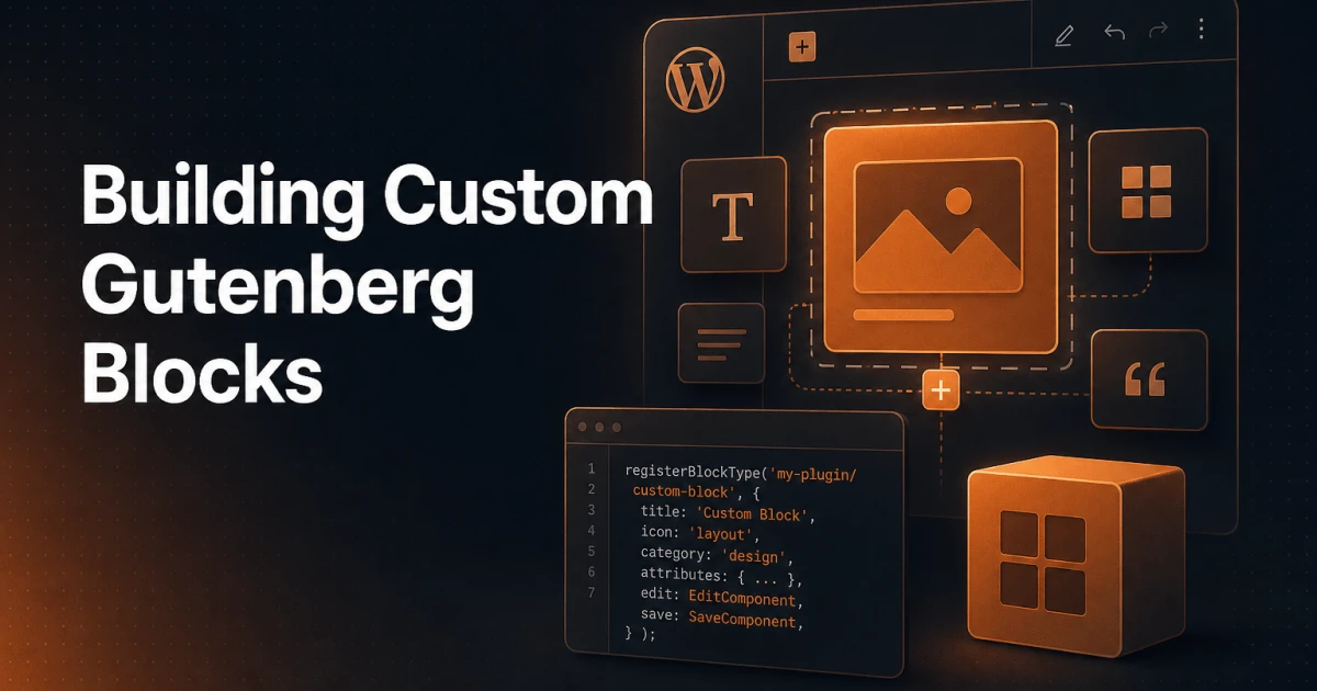
Most WordPress developers encounter Gutenberg blocks the same way: a client asks for a custom component, a quick search turns up ACF or shortcodes as the path of least resistance, and the block editor's native API quietly goes unexplored. That's a missed opportunity. Custom blocks built against the official @wordpress/blocks API are composable, portable, and fully integrated with the editor experience clients actually use every day. This guide walks through the full development lifecycle - architecture, tooling, controls, dynamic rendering, styling, and debugging - so you leave with a working block and a mental model that scales.
How Blocks Work Under the Hood
Every Gutenberg block is defined by three things: a block.json metadata file, an edit function that renders the block inside the editor, and a save function that serializes the block's output into post content. Understanding the relationship between these three is non-negotiable before writing a single line of JavaScript.
The block.json file is the source of truth. WordPress reads it at registration time to learn the block's name, title, category, icon, attributes, and which script/style handles to enqueue. A minimal example looks like this:
{
  "apiVersion": 3,
  "name": "my-plugin/callout",
  "title": "Callout",
  "category": "text",
  "icon": "megaphone",
  "description": "A highlighted callout block with a heading and body text.",
  "attributes": {
    "heading": {
      "type": "string",
      "source": "html",
      "selector": "h3"
    },
    "body": {
      "type": "string",
      "source": "html",
      "selector": "p"
    },
    "backgroundColor": {
      "type": "string",
      "default": "#f0f4ff"
    }
  },
  "editorScript": "file:./index.js",
  "editorStyle": "file:./index.css",
  "style": "file:./style-index.css"
}
The source property on an attribute tells WordPress how to read that value back out of the serialized HTML when a post is loaded. Without a source, the attribute is stored only in the block delimiter comment - useful for settings that don't need to appear in markup, like a toggle or color choice.
The edit function receives attributes and setAttributes as props and returns JSX. It runs only inside the block editor. The save function also receives attributes but returns static JSX that WordPress serializes into the database. On post load, WordPress re-runs save and compares the result against the stored markup - a mismatch triggers the "block validation failed" error, which is one of the most common debugging headaches.
Setting Up a Block Development Environment
The official scaffolding tool is @wordpress/create-block. Run it inside your wp-content/plugins directory:
npx @wordpress/create-block callout-block --namespace my-pluginThis generates a plugin directory with block.json, src/edit.js, src/save.js, src/index.js, src/style.scss, src/editor.scss, and a package.json wired up to @wordpress/scripts. The three commands you'll use constantly are:
npm start- Runs webpack in watch mode, recompiling on every file save. This is your development loop.npm run build- Produces minified production assets in thebuild/directory.npm run lint:js- Runs ESLint with WordPress coding standards. Catching linting errors early prevents subtle block validation bugs later.
The main plugin PHP file registers the block using register_block_type pointed at the build/ directory. WordPress reads block.json from there and handles script and style enqueueing automatically:
function my_plugin_register_blocks() {
    register_block_type( __DIR__ . '/build' );
}
add_action( 'init', 'my_plugin_register_blocks' );
Building Your First Custom Block
The callout block defined in block.json above needs an edit component and a save function. Start with src/edit.js:
import { useBlockProps, RichText } from '@wordpress/block-editor';

export default function Edit( { attributes, setAttributes } ) {
    const { heading, body, backgroundColor } = attributes;
    const blockProps = useBlockProps( {
        style: { backgroundColor },
    } );

    return (
        <div { ...blockProps }>
            <RichText
                tagName="h3"
                value={ heading }
                onChange={ ( val ) => setAttributes( { heading: val } ) }
                placeholder="Callout heading..."
            />
            <RichText
                tagName="p"
                value={ body }
                onChange={ ( val ) => setAttributes( { body: val } ) }
                placeholder="Callout body text..."
            />
        </div>
    );
}
useBlockProps is mandatory - it attaches the block's class names, data attributes, and event handlers that the editor needs to manage selection, drag-and-drop, and focus. Skipping it breaks editor functionality in ways that are not always immediately obvious.
Now src/save.js:
import { useBlockProps, RichText } from '@wordpress/block-editor';

export default function Save( { attributes } ) {
    const { heading, body, backgroundColor } = attributes;
    const blockProps = useBlockProps.save( {
        style: { backgroundColor },
    } );

    return (
        <div { ...blockProps }>
            <RichText.Content tagName="h3" value={ heading } />
            <RichText.Content tagName="p" value={ body } />
        </div>
    );
}
Note the distinction: in save.js you call useBlockProps.save() and RichText.Content - not the interactive versions used in edit. This is a common source of validation errors when developers copy-paste from edit to save without adjusting.
Block Attributes and Controls
The inline editing experience handles text, but settings like background color, alignment, or toggle options belong in the sidebar. InspectorControls renders its children into the block's Settings panel in the editor sidebar:
import { InspectorControls, useBlockProps } from '@wordpress/block-editor';
import { PanelBody, ColorPicker } from '@wordpress/components';

export default function Edit( { attributes, setAttributes } ) {
    const { backgroundColor } = attributes;
    const blockProps = useBlockProps( { style: { backgroundColor } } );

    return (
        <>
            <InspectorControls>
                <PanelBody title="Color Settings" initialOpen={ true }>
                    <ColorPicker
                        color={ backgroundColor }
                        onChange={ ( val ) => setAttributes( { backgroundColor: val } ) }
                        enableAlpha
                    />
                </PanelBody>
            </InspectorControls>
            <div { ...blockProps }>
                { /* RichText fields here */ }
            </div>
        </>
    );
}
For toolbar controls - alignment toggles, custom buttons that apply inline formatting - use BlockControls from @wordpress/block-editor. It slots its children into the floating toolbar that appears above a selected block. The ToolbarGroup and ToolbarButton components from @wordpress/components handle the visual rendering.
Dynamic Blocks vs Static Blocks
The save function is the right choice when your block's output is self-contained and doesn't depend on data that changes after publish - a callout, a pull quote, a styled image. But many real-world blocks need to query the database: recent posts, custom post type listings, user-specific content, or anything that must stay current without re-publishing.
For these cases, return null from the save function and render the block server-side with PHP using the render_callback parameter:
register_block_type( __DIR__ . '/build', array(
    'render_callback' => 'my_plugin_render_callout',
) );

function my_plugin_render_callout( $attributes, $content, $block ) {
    $heading = isset( $attributes['heading'] ) ? esc_html( $attributes['heading'] ) : '';
    $bg      = isset( $attributes['backgroundColor'] ) ? esc_attr( $attributes['backgroundColor'] ) : '#f0f4ff';

    ob_start();
    ?>
    <div class="wp-block-my-plugin-callout" style="background-color:<?php echo $bg; ?>">
        <h3><?php echo $heading; ?></h3>
    </div>
    <?php
    return ob_get_clean();
}
Dynamic blocks still need an edit function that shows a realistic preview inside the editor. The useBlockProps and any interactive controls work exactly as before - only the front-end output changes. One practical pattern is to use the ServerSideRender component from @wordpress/server-side-render in the edit function, which makes a REST API call to render the PHP callback live inside the editor. This keeps the editor preview accurate without duplicating markup logic in JavaScript.
Styling Blocks
The scaffold generates two style entry points: src/style.scss loads on both the front end and inside the editor; src/editor.scss loads only in the editor. Keep layout and visual rules in style.scss and editor-specific overrides - padding adjustments for the editor chrome, placeholder styling - in editor.scss.
Block styles should scope to the block's generated class name, which follows the pattern .wp-block-{namespace}-{block-name}. For the callout block:
.wp-block-my-plugin-callout {
    border-left: 4px solid currentColor;
    padding: 1.25rem 1.5rem;
    border-radius: 4px;

    h3 {
        margin-top: 0;
        font-size: 1.1rem;
    }
}
WordPress 6.x and theme.json integration means your block styles can inherit spacing, typography, and color presets defined by the active theme. Reference theme presets using CSS custom properties like var(--wp--preset--color--primary) rather than hardcoded hex values. This makes your block theme-aware - it adapts to the active theme's palette without modification.
If your block should offer style variations (like "outlined" vs "filled"), register them with register_block_style in PHP:
register_block_style( 'my-plugin/callout', array(
    'name'  => 'outlined',
    'label' => 'Outlined',
) );
WordPress appends .is-style-outlined to the block's wrapper when the user selects that variation, and you target it in CSS accordingly.
Block Patterns and Block Variations
Block patterns are pre-configured arrangements of one or more blocks that users can insert from the pattern picker. They are registered with register_block_pattern and defined as raw block markup - the same serialized HTML that WordPress stores in the database. Patterns are ideal for delivering opinionated starting layouts to clients: a hero with a heading, subheading, and button; a two-column feature row; a testimonial grid.
Block variations are a subtly different concept: they apply to a single block type and pre-populate specific attributes. The core Embed block uses this pattern extensively - "YouTube", "Vimeo", and "Twitter" are all variations of the same underlying block with different providerNameSlug attribute values. Register a variation with the JavaScript registerBlockVariation function from @wordpress/blocks:
import { registerBlockVariation } from '@wordpress/blocks';

registerBlockVariation( 'my-plugin/callout', {
    name: 'warning',
    title: 'Warning Callout',
    attributes: { backgroundColor: '#fff3cd' },
    icon: 'warning',
} );
Variations appear as distinct options in the block inserter while sharing the same underlying block registration, which keeps your codebase lean.
Testing and Debugging Blocks
Block validation errors - "This block contains unexpected or invalid content" - are the most disorienting failure mode in block development. They occur when the output of the save function doesn't match the HTML stored in the database. Common causes include:
Attribute source mismatch: Changing a
sourceorselectorinblock.jsonafter blocks have been saved. Existing posts store the old markup, and the new save function generates different HTML. The fix is a block deprecation entry that teaches WordPress how to migrate old markup.Using
useBlockPropsinstead ofuseBlockProps.save()in save.js: The interactive version includes event handlers that the serializer strips, causing a class or attribute mismatch on load.Non-deterministic output in save: Any value in save that changes between renders -
Math.random(),Date.now(), or a value derived from component state rather than attributes - will cause validation failures on every load.
For active debugging, the @wordpress/e2e-test-utils package provides Playwright-based end-to-end tests that can insert blocks, set attributes, and verify front-end output programmatically. For faster iteration during development, the browser console logs detailed validation error diffs that show exactly which attribute or element caused the mismatch.
Keep an eye on block markup with the Diff Checker when comparing expected vs actual serialized output across deprecation migrations - it's faster than reading raw console diffs for longer blocks.
When building blocks that affect front-end performance - particularly dynamic blocks that run database queries - it's worth auditing the rendered output with the SEO Analyzer to catch heading hierarchy issues, missing alt text on images, or markup patterns that interfere with structured data. A custom block that inadvertently wraps content in an extra heading level or omits semantic markup can silently degrade both Core Web Vitals and crawlability.
Custom Gutenberg blocks are not a workaround or an advanced edge case - they are the correct primitive for extending the WordPress editor. A block built against the official API is portable across themes, compatible with Full Site Editing, and maintainable by any developer who knows the block editor. The upfront investment in understanding block.json, the edit/save contract, and the attribute system pays back every time a client needs a layout change that doesn't require a developer.