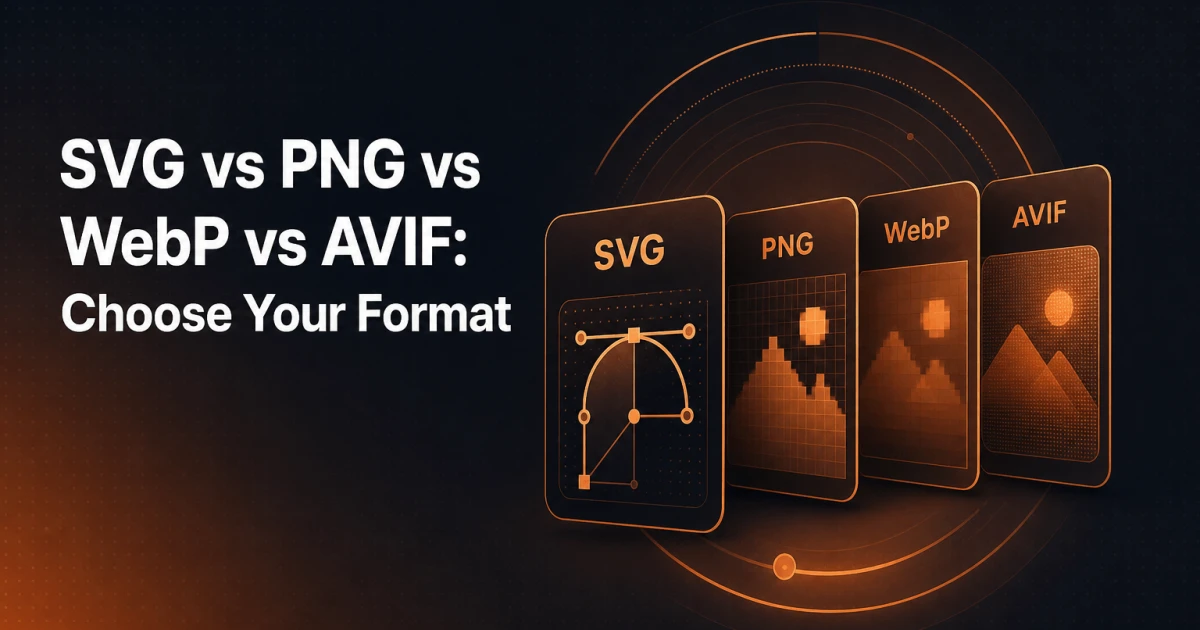
Every image you ship to a browser is a performance decision. Pick the wrong format and you are either sending bloated files that slow page load, or degraded visuals that undermine the design. The four formats that matter most in 2025 - SVG, PNG, WebP, and AVIF - each occupy a distinct role, and understanding where each one excels prevents the most common mistakes: using PNG for photographs, serving JPEG where WebP is universally supported, or reaching for WebP when SVG would cost zero bytes at any screen size.
This guide cuts through format theory and focuses on practical decisions: what each format is built for, where it breaks down, and how to serve the right format from a WordPress site without overcomplicating your workflow.
SVG: The Format That Scales Without a Cost
SVG (Scalable Vector Graphics) is not a raster format - it is an XML-based description of shapes, paths, and coordinates. Because the browser renders SVG from mathematical instructions rather than a fixed pixel grid, the image is infinitely scalable. A 2 KB SVG logo looks identical on a 13-inch laptop and a 4K display. No blurring, no pixelation, no need to produce @2x or @3x variants.
This makes SVG the unambiguous choice for:
Logos and wordmarks - brand assets that must appear crisp at every size, from a 16px favicon to a full-width hero treatment.
Icons and UI elements - navigation icons, social icons, decorative dividers, and any symbol that needs to inherit CSS color or animate on hover.
Illustrations with flat or gradient fills - diagrams, charts, infographics, and brand illustrations that originate in a vector tool like Figma or Illustrator.
SVG also unlocks capabilities no raster format can match: you can target SVG elements with CSS, animate paths with JavaScript, and inline the markup directly into HTML to eliminate an HTTP request entirely. For icon systems, inline SVG combined with a <use> sprite pattern is still one of the most performant approaches available.
The limitation is equally clear. SVG is unsuitable for photographs. A photographic image contains millions of colour variations that cannot be efficiently described as vector paths. Attempting to export a photograph as SVG produces either a grotesquely large file or a visually degraded result. Photographs belong in raster formats - the question is which one.
If you need to convert an existing raster asset into an SVG for use as an icon or logo, the PNG & WebP to SVG converter handles that conversion directly in the browser.
PNG: Lossless Precision With a File Size Penalty
PNG uses lossless compression. Every pixel in the original image is preserved exactly in the output. This fidelity comes at a cost - PNG files are substantially larger than equivalent WebP or AVIF files, often by a factor of two to five for photographic content.
Despite that, PNG remains the correct choice in specific situations:
Images requiring hard-edged transparency - product cut-outs, UI screenshots with transparent backgrounds, logos exported from design tools where the vector source is unavailable.
Screenshots and screen recordings - pixel-accurate captures of interfaces, code editors, or terminal output where any lossy compression introduces visible artefacts around text.
Images with large areas of flat colour - PNG's compression algorithm handles solid and near-solid regions efficiently, making it competitive for simple graphics that are not suited to SVG.
The argument for PNG has narrowed considerably since WebP introduced lossless mode with transparency support at significantly smaller file sizes. For new assets, WebP lossless is almost always the better choice. PNG's continued relevance is mainly in legacy workflows, tooling that does not yet export WebP by default, and edge cases where maximum compatibility with very old software matters.
WebP: The Current Default for Most Web Images
WebP was developed by Google and introduced both lossy and lossless compression modes, along with native transparency support in both. Browser support is now effectively universal - every major browser has supported WebP since 2020, including Safari since version 14. For production web work in 2025, WebP is the baseline format for raster images.
The compression advantage is significant. Lossy WebP typically produces files 25-35% smaller than equivalent JPEG at comparable visual quality. Lossless WebP beats PNG by roughly 26% on average according to Google's own benchmarks. That reduction translates directly to faster Core Web Vitals scores - particularly Largest Contentful Paint, which is heavily influenced by image load time.
WebP handles the full range of photographic content, illustrations, and UI assets. Its lossy mode is well-suited to hero images, blog post thumbnails, product photography, and background images. Its lossless mode with transparency is a direct replacement for PNG in most workflows. The format also supports animation, making it a more efficient alternative to GIF for simple motion graphics.
The practical question for WordPress developers is not whether to use WebP, but how to automate the conversion so that authors do not need to think about it. Most modern image optimisation plugins handle this automatically on upload.
AVIF: Superior Compression, Growing Support
AVIF (AV1 Image File Format) is derived from the AV1 video codec and represents the current frontier of web image compression. At equivalent visual quality, AVIF consistently outperforms WebP - typically by 20-50% on photographic content. For high-detail photographs, the gap is particularly pronounced.
AVIF supports lossy and lossless compression, wide colour gamut (including HDR content), and alpha transparency. Its colour science is notably better than WebP for gradients and skin tones, which matters for high-end product photography and editorial images.
Browser support in 2025 is strong but not yet universal. Chrome, Firefox, and Edge have supported AVIF since 2021-2022. Safari added support in version 16 (released late 2022), meaning the vast majority of active Safari users now have AVIF-capable browsers. The practical approach is to serve AVIF to supporting browsers via the HTML <picture> element, with a WebP fallback - not to choose between them.
<picture>
  <source srcset="image.avif" type="image/avif">
  <source srcset="image.webp" type="image/webp">
  <img src="image.jpg" alt="Description" width="800" height="600">
</picture>
This pattern gives AVIF-capable browsers the smallest possible file while ensuring compatibility everywhere else. The <img> fallback also ensures that the image is indexed correctly by search engines, which do not yet process all source variants in a picture element.
Encoding speed is AVIF's main practical limitation. AVIF encoding is significantly slower than WebP, which can be a bottleneck when processing large image libraries on upload. Most WordPress plugins that support AVIF generation address this with background processing queues.
Decision Matrix: Format by Use Case
| Use Case | Recommended Format | Rationale |
|---|---|---|
| Logo / wordmark | SVG | Infinitely scalable, CSS-styleable, tiny file size |
| UI icons | SVG | Inline or sprite, animatable, no raster variants needed |
| Flat illustration / diagram | SVG (or WebP if raster-only) | Vector origin preferred; WebP if exported from bitmap tool |
| Photograph (hero, editorial) | AVIF + WebP fallback | Maximum compression, best colour fidelity |
| Product image with transparency | WebP (lossless) or AVIF | Replaces PNG at smaller file sizes |
| Screenshot / UI capture | PNG or WebP lossless | Text edges require lossless; WebP preferred for size |
| Thumbnail / blog post image | WebP | Universal support, excellent lossy quality-to-size ratio |
| Animation (simple) | WebP or AVIF | Both support animation; far more efficient than GIF |
| Favicon | SVG (modern) + ICO fallback | SVG favicons supported by all modern browsers |
| Open Graph / social preview image | PNG or JPEG | Social crawlers have inconsistent WebP/AVIF support |
The Open Graph row deserves a note. Social platforms - Facebook, LinkedIn, Twitter/X - crawl your OG image tags and render previews. Their crawlers do not reliably support WebP or AVIF, so serving a modern format as your og:image can result in broken preview images. Keep Open Graph images as PNG or JPEG regardless of what format you serve on the page itself. You can verify how your Open Graph tags render using the Open Graph Preview tool.
WordPress Implementation
WordPress 5.8 introduced native WebP upload support, and WordPress 6.1 added WebP generation for image sub-sizes on upload. As of WordPress 6.5, AVIF is also supported for upload. This means that for many sites, WebP conversion is now built into core - but the behaviour depends on your server's GD or Imagick library version and configuration.
Serving Modern Formats Automatically
The most reliable approach for serving AVIF and WebP automatically is a dedicated image optimisation plugin. When evaluating options, the key features to look for are:
Automatic conversion on upload - new images should be converted without manual steps, so content authors are never blocked.
Bulk conversion for existing media - a library of existing PNG and JPEG images needs a retroactive processing queue.
Serving via
<picture>orsrcset- the plugin should rewrite image output in the front end to serve AVIF/WebP to supporting browsers while maintaining JPEG/PNG fallbacks.CDN compatibility - if you serve images through a CDN, confirm the plugin's rewriting logic works correctly with your CDN's caching headers.
For SVG uploads, WordPress blocks SVG by default due to the potential for embedded scripts in SVG files. The Signocore Toolkit plugin includes SVG upload support with sanitisation, enabling safe use of SVG assets in the media library without requiring custom code.
Browser Support and the Picture Element
The <picture> element is the correct mechanism for format negotiation in HTML. The browser evaluates <source> elements in order and selects the first format it supports. This means you can stack AVIF, WebP, and JPEG without any server-side logic:
<picture>
  <source srcset="photo.avif" type="image/avif">
  <source srcset="photo.webp" type="image/webp">
  <img src="photo.jpg" alt="Alt text" width="1200" height="800" loading="lazy">
</picture>
Always include explicit width and height attributes on the <img> element. Without them, the browser cannot calculate the image's aspect ratio before the file loads, which causes layout shift and damages your Cumulative Layout Shift score - one of the three Core Web Vitals.
Compression and Conversion Tools
Before images reach WordPress, pre-processing them to the correct format and dimensions is worth the effort. Uploading an oversized JPEG and relying on WordPress to generate sub-sizes does not eliminate the original from your media library - it just adds smaller variants. Starting with a correctly sized, correctly formatted source file keeps your media library clean.
For quick format conversions and compression without installing software, the Image Converter and Image Compressor tools handle common conversions directly in the browser. For background removal before exporting a product image as WebP with transparency, the Background Remover handles that step as well.
Image performance also feeds directly into SEO audits. The SEO Analyzer surfaces image-related issues including missing alt attributes, oversized files, and missing width/height declarations - giving you a clear view of which images on a given page need attention.
The Format Decision Is Not Set-and-Forget
Format support continues to evolve. JPEG XL offers compression characteristics that rival AVIF with faster encoding, and browser adoption is progressing. What matters now is establishing a workflow that defaults to modern formats - AVIF with WebP fallback for photographs, WebP for general raster assets, SVG for everything that originates as a vector - while keeping the tooling flexible enough to incorporate new formats as support matures.
The sites that load fastest are not the ones that made a single format decision years ago. They are the ones with a systematic image pipeline: correct format at the source, appropriate compression, responsive sizing with srcset, and lazy loading for off-screen images. Each of those steps compounds. Together, they move the needle on both page speed and search visibility in ways that individual optimisations rarely achieve alone.