On a typical WordPress site, images account for 50 to 75 percent of total page weight. Not JavaScript, not fonts, not third-party scripts - images. A single unoptimized hero image can weigh more than an entire well-built web page should. That single fact is why image optimization remains the highest-leverage performance improvement available to most site owners, and why Google's Core Web Vitals place so much emphasis on metrics like LCP (Largest Contentful Paint), which is almost always triggered by an image.
This guide covers the complete picture: choosing the right format, compressing intelligently, serving images responsively, and building a practical workflow that doesn't require manual intervention on every upload.
Why Images Are the Biggest Performance Bottleneck
WordPress makes it easy to upload images and hard to optimize them. The default media library stores whatever you upload - a 4MB JPEG from a DSLR camera, a PNG screenshot at full desktop resolution, a product photo exported from Photoshop with all metadata intact. None of that is wrong in isolation, but the cumulative effect on page load time is severe.
A page with five unoptimized images at 1-2MB each forces a visitor on a 4G mobile connection to download 5-10MB before the page feels usable. Google's PageSpeed Insights will flag every one of those images, and your LCP score will reflect it. Studies from HTTP Archive consistently show that the median mobile page transfers around 1MB of images - but the 90th percentile transfers over 4MB. That gap is where most WordPress sites live.
The fix is not a single setting. It is a combination of format selection, compression, responsive delivery, and lazy loading - each addressing a different dimension of the problem.
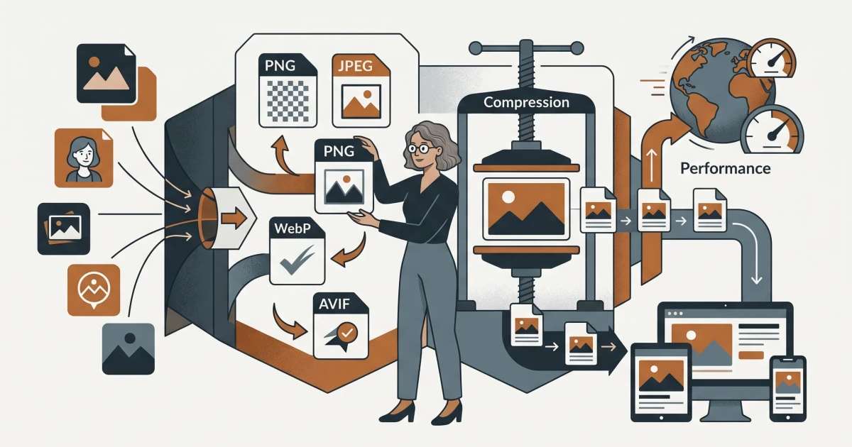
Format Comparison: Choosing the Right Container
The image format you choose sets a ceiling on how good your optimization can be. Compressing a PNG aggressively will never match the efficiency of a well-encoded WebP of the same image.
JPEG - The Workhorse
JPEG remains the most widely supported format for photographic content. It uses lossy compression, meaning it discards visual data that human perception is least sensitive to. At quality settings between 75 and 85, a JPEG typically loses no perceptible quality while reducing file size by 60-80% compared to an uncompressed original. A 2MB raw photo becomes a 200-400KB JPEG that looks identical on screen.
JPEG struggles with images that have sharp edges, text, or flat color areas - you will see compression artifacts (the blocky distortions around high-contrast boundaries). For those use cases, it is the wrong choice.
PNG - Precision Over Size
PNG uses lossless compression, meaning every pixel is preserved exactly. This makes it the correct choice for logos, icons, screenshots with text, and any image where sharp edges or transparency are required. The trade-off is file size: a PNG of a photographic image will be significantly larger than an equivalent JPEG, sometimes by a factor of five or more.
If you are serving a PNG of a photograph, that is almost always a mistake worth correcting. If you are serving a PNG of a product interface screenshot or a logo with a transparent background, PNG earns its larger size.
WebP - The Modern Default
WebP was developed by Google and offers both lossy and lossless compression modes. In lossy mode, WebP typically produces files 25-35% smaller than JPEG at equivalent visual quality. In lossless mode, it outperforms PNG by 15-25%. It also supports transparency, which JPEG does not.
Browser support for WebP is now effectively universal - all major browsers including Safari (since version 14) support it. For any WordPress site running today, WebP should be the default delivery format for photographs and complex graphics. A 300KB JPEG hero image becomes a 200KB WebP with no visible quality difference.
AVIF - The Next Generation
AVIF is derived from the AV1 video codec and represents the current state of the art in image compression. At equivalent visual quality, AVIF files are typically 40-50% smaller than JPEG and 15-20% smaller than WebP. It handles gradients, film grain, and wide color gamuts particularly well.
The catch is encoding speed - AVIF takes significantly longer to compress than WebP, which matters in automated pipelines. Browser support is strong in Chrome and Firefox, but Safari only added full support in version 16.4. For most WordPress sites, AVIF is worth serving where supported, with WebP as a fallback. The <picture> element makes this straightforward.
| Format | Best For | Compression Type | Transparency | Typical Size vs. JPEG |
|---|---|---|---|---|
| JPEG | Photographs | Lossy | No | Baseline |
| PNG | Logos, screenshots, transparency | Lossless | Yes | +200-500% |
| WebP | Most web images | Lossy + Lossless | Yes | -25 to -35% |
| AVIF | High-quality photographs | Lossy + Lossless | Yes | -40 to -50% |
Compression Strategies: Lossless vs. Lossy
Lossless compression removes redundant data without discarding any image information - the decompressed result is bit-for-bit identical to the original. Lossy compression permanently discards data that is considered perceptually insignificant, achieving much higher compression ratios at the cost of some fidelity.
For web delivery, lossy compression is almost always the right choice for photographs and complex images. The key question is: at what quality setting does the trade-off become unacceptable?
Finding the Right Quality Setting
The relationship between quality setting and file size is not linear. For JPEG and WebP, the difference between quality 90 and quality 80 can mean a 40% reduction in file size with minimal visible change. The difference between quality 80 and quality 70 often produces visible artifacts while saving less additional space.
A practical approach: start at quality 80 for photographs, export the result, and view it at 100% zoom on your target screen size. If you cannot identify compression artifacts, you have headroom to go lower. If you see blocking or smearing around edges, move up. For most product photos and editorial images, quality 75-82 is the sweet spot. For images with fine texture detail - fabric, hair, foliage - stay closer to 85.
For PNGs, lossless optimization tools like oxipng or pngquant can reduce file sizes by 20-40% without any quality loss, simply by removing unnecessary metadata and optimizing the compression algorithm. This is always worth doing before serving a PNG.
Strip Metadata
Every image taken with a camera or smartphone contains EXIF metadata: GPS coordinates, camera model, shutter speed, color profiles, and more. This data is invisible to the visitor but adds 10-50KB to every image file. Stripping it during export or optimization is a free performance gain with zero visual impact.
Responsive Images: srcset and sizes
Serving a 1600px-wide image to a mobile device with a 390px-wide screen wastes bandwidth proportional to the square of the dimension difference - that mobile visitor downloads roughly 17 times more pixel data than they can display. Responsive images solve this by letting the browser select the most appropriate image size for the current device.
The srcset attribute provides a list of image sources with their intrinsic widths. The sizes attribute tells the browser how wide the image will actually be rendered at different viewport widths. Together, they allow precise control:
<img
  src="hero-800.webp"
  srcset="hero-400.webp 400w, hero-800.webp 800w, hero-1600.webp 1600w"
  sizes="(max-width: 600px) 100vw, (max-width: 1200px) 50vw, 800px"
  alt="Product hero image"
  width="800"
  height="450"
>
WordPress generates multiple image sizes automatically on upload (thumbnail, medium, large, full), but the default sizes do not always match your theme's actual layout. Registering custom image sizes with add_image_size() and using wp_get_attachment_image() with the correct size name ensures WordPress outputs meaningful srcset values rather than serving oversized images to every visitor.
Always specify explicit width and height attributes on your <img> tags. This allows the browser to reserve space for the image before it loads, preventing layout shifts that damage your CLS score - another Core Web Vital.
Lazy Loading: Defer What the Visitor Can't See
Lazy loading defers the download of images that are outside the current viewport. A visitor landing on a long page doesn't need to download images 2,000 pixels below the fold before they can start reading. The browser's native loading="lazy" attribute handles this with no JavaScript required:
<img src="image.webp" loading="lazy" alt="Description" width="600" height="400">One critical exception: never apply lazy loading to your above-the-fold hero image or any image visible on initial page load. Doing so delays the browser from fetching the image that determines your LCP score, which will hurt your Core Web Vitals significantly. Use loading="eager" or simply omit the attribute for those images. A dedicated article on lazy loading strategies - including priority hints and preloading - is coming separately.
Practical Workflow: Tools That Remove the Manual Work
The biggest barrier to consistent image optimization is friction. When the workflow requires opening a desktop application, exporting at the right settings, and re-uploading, it doesn't happen reliably. A browser-based toolset eliminates that friction.
The Image Compressor handles lossy and lossless compression for JPEG, PNG, and WebP files directly in the browser. Upload your image, set the quality level, and download the optimized version - no account required, no software to install. For a typical product photo, this step alone reduces file size by 40-70%.
When your source image is larger than it needs to be for its intended display size, the Image Resizer and Cropper lets you set exact pixel dimensions before compression. Resizing a 4000x3000px photograph down to 1200x900px before compressing reduces the file size by roughly 90% before compression even begins - because you are working with a fraction of the original pixel data.
For product images or any asset that needs a transparent background, the Background Remover handles subject isolation cleanly, outputting a PNG with transparency that you can then convert to WebP. You can convert between formats using the Image Converter, which supports conversion to WebP and other modern formats from any common input type.
A Repeatable Pre-Upload Checklist
Resize to display dimensions first. Determine the maximum width the image will ever be displayed at (accounting for retina displays, multiply by 2), and resize to that width before doing anything else. A full-width desktop image rarely needs to exceed 1600px wide.
Choose the right format. Photograph with no transparency: WebP lossy. Logo or graphic with transparency: WebP lossless or PNG. Illustration with flat colors: SVG if possible, otherwise PNG.
Compress at an appropriate quality setting. Start at 80 for photographs, verify visually, adjust as needed. Strip EXIF metadata.
Verify the output file size. A typical hero image should be under 150KB. Product thumbnails should be under 30KB. If you are over these thresholds, investigate why before uploading.
WordPress-Specific Considerations
WordPress's media handling has improved significantly in recent versions. Since WordPress 5.8, the platform supports WebP natively - you can upload WebP files directly and they will be stored and served correctly. WordPress 6.1 added experimental AVIF support.
Media Library Settings
WordPress's default JPEG compression quality is 82, which is reasonable. You can adjust this with the jpeg_quality filter if your theme requires higher fidelity or if you want to push further for performance. More importantly, WordPress generates multiple intermediate sizes on upload - check which sizes your theme actually uses. Unneeded image sizes consume disk space and slow down uploads. Disable unused sizes with add_filter('intermediate_image_sizes_advanced', ...) or a plugin that surfaces this as a setting.
Serving WebP Automatically
If you are not converting images to WebP before uploading, a server-side solution can handle conversion on the fly. Many caching and performance plugins include WebP conversion as a feature. Alternatively, configuring your server to serve .webp versions when the browser's Accept header indicates support - and the file exists - is a clean solution that requires no plugin dependency. An .htaccess rule handles this on Apache servers, which you can generate and test with the .htaccess Generator.
Image CDN Delivery
An image CDN transforms and delivers images on demand from edge locations close to the visitor. Instead of storing 10 variants of every image on your server, you store one high-quality master and let the CDN resize, convert, and compress at request time. Cloudflare Images, Cloudinary, and similar services operate this way. For high-traffic sites or sites with large image libraries, this approach reduces both storage overhead and bandwidth costs while ensuring visitors always receive the optimal format for their browser.
Image optimization is one of the few areas in web performance where the effort-to-impact ratio is genuinely favorable. A few hours of systematic work - auditing your existing media library, establishing a pre-upload workflow, and configuring WordPress to serve modern formats - can cut page weight by half or more. That translates directly into faster LCP scores, lower bounce rates, and better rankings. The tools exist, the formats are mature, and browser support is universal. The only remaining variable is whether you apply them consistently.