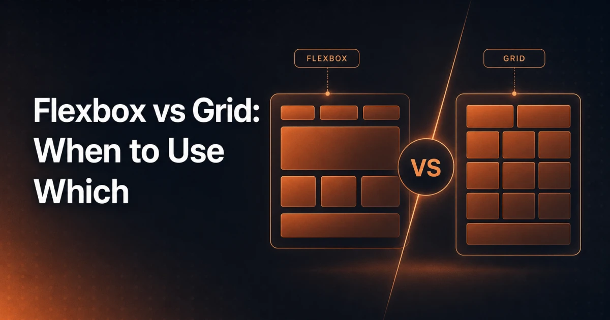
Most front-end developers learn Flexbox first, get comfortable with it, and then quietly reach for it in situations where Grid would have taken half the code. The result is nested flex containers solving problems that a single grid-template-columns declaration would handle cleanly. Both layout systems are mature, fully supported, and genuinely useful - but they solve fundamentally different problems, and mixing them up costs you maintainability.
The Mental Model That Changes Everything
Flexbox is a one-dimensional layout system. It arranges items along a single axis - either a row or a column - at any given time. You can wrap rows, but the flex container itself does not coordinate across both axes simultaneously. Each row wraps independently; items in one row have no relationship to items in the next.
Grid is a two-dimensional layout system. It controls rows and columns at the same time. A grid container defines a coordinate space, and every child can be placed anywhere within it - spanning multiple rows, multiple columns, or overlapping other elements entirely.
This single distinction explains almost every "which one should I use?" decision. If your layout problem lives on one axis, Flexbox is the right tool. If your layout requires alignment across both axes simultaneously, Grid is the right tool.
A useful shorthand: Flexbox is content-driven (the items determine the layout), while Grid is layout-driven (the container defines the structure, and items fill it).
When Flexbox Is the Right Choice
Navigation Bars
A horizontal navigation bar is the canonical Flexbox use case. Picture a <nav> element with a logo on the left, five links in the center, and a CTA button on the right. The items flow along a single row, and justify-content: space-between handles the spacing in one line. The items themselves determine how much space they need; the container just distributes what remains. Adding or removing a nav item does not break the layout - it simply reflows.
.nav {
  display: flex;
  align-items: center;
  justify-content: space-between;
  gap: 1.5rem;
}
Card Rows With Wrapping
A row of product cards or blog post previews that wraps to a second line when the viewport narrows is another natural Flexbox pattern. Each card has a minimum width, and flex-wrap: wrap lets them break to the next line organically. The visual output here is a row of three cards on desktop, two on tablet, one on mobile - with no media queries required if you combine flex-wrap with flex-basis and min-width.
The key limitation to notice: those two rows are independent. If one card in the first row is taller than its siblings, the second row does not align to compensate. That is Flexbox behaving correctly - it only governs one axis.
Centering a Single Element
Vertically and horizontally centering content inside a container - a modal, a hero section, a loading spinner - is two lines with Flexbox:
.container {
  display: flex;
  align-items: center;
  justify-content: center;
}
This works reliably across every modern browser and requires no knowledge of the child element's dimensions.
Small Component Alignment
Inside a button with an icon and a label, inside a form field with a prefix symbol, inside a badge with a dot and text - these are micro-layout problems that live entirely on one axis. Flexbox handles them with minimal code and no need to define explicit columns or rows.
When Grid Is the Right Choice
Full Page Layouts
Imagine the classic web page skeleton: a full-width header at the top, a sidebar on the left taking up roughly 25% of the width, a main content area filling the rest, and a full-width footer at the bottom. Defining this with Flexbox requires nested containers and careful math. With Grid, the entire structure is declared on a single parent:
.page {
  display: grid;
  grid-template-columns: 250px 1fr;
  grid-template-rows: auto 1fr auto;
  grid-template-areas:
    "header header"
    "sidebar main"
    "footer footer";
  min-height: 100vh;
}
Every major section is placed by name. Moving the sidebar from left to right, or converting to a top navigation, is a one-line change in grid-template-areas. No wrapper elements, no margin hacks.
Complex Asymmetric Designs
Consider a magazine-style article layout where the lead image spans three columns, the headline occupies two, a pull quote sits in the third column beside the first two paragraphs, and a full-width image breaks the flow midway through. This is precisely the kind of design that breaks Flexbox - not because Flexbox is weak, but because the layout requires cross-axis coordination that Flexbox does not provide.
With Grid, each element is assigned explicit grid-column and grid-row values. The container holds the coordinate system; the children navigate it. The visual result is a rich editorial layout that would otherwise require absolute positioning or float-based hacks.
Overlapping Elements
Grid is the only native CSS layout method that lets elements occupy the same grid cells intentionally. A hero section where a text overlay sits on top of a background image - without absolute positioning - can be built by placing both elements at grid-column: 1 / -1; grid-row: 1 and controlling stacking with z-index. The image fills the cell naturally; the text overlay sits in the same space. This approach keeps elements in the normal document flow, which has meaningful implications for accessibility and Core Web Vitals - particularly Cumulative Layout Shift.
Responsive Grids Without Media Queries
One of Grid's most underused features is auto-fill combined with minmax():
.grid {
  display: grid;
  grid-template-columns: repeat(auto-fill, minmax(280px, 1fr));
  gap: 1.5rem;
}
Visually, this creates a grid of cards that fits as many 280px-minimum columns as the container allows. At 1200px wide, you get four columns. At 700px, you get two. At 300px, you get one. No media queries. The browser calculates the column count algorithmically.
Using Flexbox and Grid Together
The most effective layouts typically combine both systems - Grid for the macro structure, Flexbox for the micro components inside each grid area. This is not a compromise; it is the intended use of both specifications.
A practical example: the overall page uses Grid to define the header, sidebar, main, and footer areas as described above. Inside the header grid area, a Flexbox container aligns the logo, navigation links, and CTA button along a single row. Inside the main content area, a Flexbox row lays out a series of feature cards. Inside each card, another Flexbox column stacks the image, title, body text, and action link vertically with consistent spacing.
The rule of thumb: use Grid when you need to place something on the page, use Flexbox when you need to arrange things inside a component. The boundary is not rigid, but it is a reliable starting point.
Another practical combination: a CSS Grid layout where one of the grid cells contains a flex container that needs to push its last child (a footer link, a "read more" button) to the bottom of the card regardless of content length. Grid defines the card's position and dimensions in the overall layout; Flexbox with flex-direction: column and margin-top: auto on the last child handles the internal alignment.
Browser Support in 2026
Legacy hesitation around Grid support is no longer warranted. CSS Grid has been supported across all major browsers since 2017, and the more advanced features - subgrid, grid-template-areas, minmax(), auto-fill - have reached full cross-browser support. As of 2026, global browser support for CSS Grid sits above 97%, and subgrid - which allows nested grids to align to the parent grid's track definitions - is supported in all evergreen browsers.
Flexbox support is effectively universal. The old prefixed syntax (-webkit-flex, the 2009 display: box spec) is irrelevant for any project targeting browsers from the last five years.
If your project still carries IE11 compatibility requirements, that is a separate conversation - but for the overwhelming majority of WordPress themes, web applications, and agency projects built today, both layout systems can be used without fallback concerns.
Rapid Prototyping With a Generator
Understanding the mental model is essential; translating it into working code quickly is a separate skill. When you are prototyping a layout and need to experiment with justify-content, align-items, flex-wrap, and gap values without cycling through a code editor and browser refresh loop, a visual generator speeds up the iteration significantly.
The Signocore CSS Flexbox Generator lets you configure flex containers visually and copy the generated CSS directly - useful for locking in the right combination of properties before writing it into a component. For Grid layouts, the CSS Grid Generator handles column and row definitions, gap settings, and grid-template-areas output. Both tools are browser-based and require no account - part of Signocore's broader developer utilities collection.
These tools are particularly useful when working inside WordPress block themes or custom Gutenberg blocks, where layout CSS often needs to be precise and minimal - bloated layout code has a compounding effect on render performance that shows up in Core Web Vitals scores.
A Decision Framework You Can Actually Use
Before writing a single line of layout CSS, ask one question: does this layout need to coordinate across both rows and columns at the same time? If yes, use Grid. If no - if items simply need to flow along one axis and respond to available space - use Flexbox.
Navigation bar, button internals, icon-plus-label alignment, form field layout: Flexbox. Full page skeleton, editorial grid, asymmetric card layout, overlapping layers: Grid. Complex page with both macro structure and micro components: Grid for the outer shell, Flexbox inside the components.
The developers who write the cleanest layout code are not the ones who know every CSS property - they are the ones who match the right tool to the right problem before touching the keyboard. Flexbox and Grid are not interchangeable alternatives; they are complementary systems designed for different layers of the same layout hierarchy.